Keep Out the Devil

Across the country millions of people spend their days locked in tiny cells. In every city we see large sections of fenced land containing massive multi-level structures dedicated solely to housing inhabitants. With barely enough space for a bed and a few belongings, residents pass their time by playing games, conversing with one another or watching television. Of course, they usually have little free time, since a majority of their day is spent serving society by performing the more unpleasant but necessary jobs. Most of the people trapped in these facilities end up there because of poverty or poor choices, and they can’t wait to be free and move on with their lives. Yes, apartment life is terrible.

The apartment is a very interesting concept for many reasons. While residents live in close proximity to each other, even sharing hallways, elevators and laundry rooms, they tend to avoid social interaction. Also, apartments are usually managed by an elected council of representatives, producing a unique political dynamic. However, there is one behavior in particular that consistently and seriously threatens the security of the entire building’s population: holding the door open for others.

Holding the door was once considered a chivalrous act. While many still interpret it as such, others are insulted that a stranger has judged them too frail or incompetent to open their own door. The way they see it, helping certain strangers with trivial tasks such as holding the door is discriminatory, and they’re right.

Despite our culture’s emphasis on equality and individualism, people regularly treat others differently depending on many outward characteristics, including sex, age, race, clothing and physical ability. Whether we’re giving up our seat to a pregnant woman, offering an elderly person our place in line or donating to the homeless, the motivation for these acts is based on the perception that another’s need is greater than our own. While it may be that those we are assisting do not require assistance, the fact is that these deeds of kindness are often based on shallow judgments and forgotten tradition. However, it could be argued that since these kind acts are motivated by empathy, they ought to be encouraged. But empathy doesn’t ensure a positive result, for as Dr. Grant stated when confronting Billy about the stolen raptor eggs, “some of the worst things imaginable have been done with the best intentions.”

One might wonder how something as simple and well-meaning as holding the door for a stranger could be harmful, but if we make the decision to allow an unknown person into the building, then the safety of each resident is compromised. If it’s acceptable to allow strangers through the building’s security system, then we might as well prop the door open for all to enter.

We may defend this behavior by arguing that the stranger seemed honest and kind, but the truth is that we were simply overcome by the obligation to be polite. Martin Vanger was right when he said that the fear of offending is greater than the fear of pain. Also, if our argument for allowing a stranger into the building is based on a brief judgement, then we’re claiming to possess the ability to determine who is and isn’t a criminal by merely looking at them for a few seconds, which would render the debate over torture and interrogation meaningless and the entire judicial system useless.

So if we aren’t supposed to hold the door for strangers, what about people we recognize from our building? First of all, it’s entirely possible that we are mistaken. It could also be that we do recognize them, but they are no longer is a resident of the building. In fact, they could have been evicted after breaking up with their partner, and they’re returning to exact revenge – revenge made possible by a careless and helpful stranger.

Whether it’s a mother pushing a stroller or an elderly man carrying groceries, the risk is too great to allow them to enter freely. We must do what’s fair and sensible and shut the door in their faces.

Attacking Art

Although it’s completely unnecessary for survival, most consider art to be an essential part of human life. After all, it is one of the five pillars of civilization. Despite the importance we place on it, offering an adequate description of art can be difficult. Most of us have a general understanding of art, pointing to classical paintings and sculptures such as Michelangelo’s Sistine Chapel ceiling and statue of David as examples, but what about more contemporary and peculiar pieces like Jackson Pollock’s No. 5 or Ellsworth Kelly’s Cowboy?

One of the ramifications of a poor definition of art is the frivolous labeling of individuals as artists. Classic forms of art include painting, sculpting and pottery, music, dance, acting and literature, but the term has been increasingly used to include modern vocations and hobbies such as photography, graphic design, 3D modeling, architecture, tattooing and rap. In its advertisements, Subway even claims that its employees are sandwich artists, stretching the concept of art so thin as to bankrupt it of meaning.

While it’s true that there is a degree of creativity and skill involved in nearly all aspects of life, that alone doesn’t make it art. If we include every craft, structure, schematic, machine, weapon, tool, toy, sport, code and clothing in the definition of art, then every person on Earth is an artist (as well as most animals). In that case, we would need to create a new term to describe works done for aesthetic and expressive purposes and another to describe those who devote themselves to their creation. However, creating a new word simply because its definition has been corrupted by misuse is no way to build a language.

Debate over the legitimacy of various artists and expressions can be intense, with parties citing arbitrary qualifications to suite their particular understanding of art. However, without a universally-accepted set of criteria to recognize it, how can one claim that something is or isn’t art? Although placing a restrictive definition on something as diverse and interpretive as art may seem impossible, perhaps it’s possible to establish some general guidelines. By looking to history for examples, we can glean at least four crucial criteria:

  1. Originality
  2. Meaning
  3. Skill
  4. Purpose

In order to qualify as art, a piece must be original. If a painter were to merely reproduce a famous painting, such as Picasso’s Guernica, it would not be heralded as a great work but merely an homage. In addition, a mass-produced item, such as a dime, may be beautiful, but it is not unique and therefore can’t be art. It’s also important to note the difference between an artist and a performer, since a performer is not necessarily generating something new. Although a performance may be meaningful and skillful, displaying another’s creation does not make the performer an artist.

The second criteria of art is meaning. The piece must be an expression of an emotion, event or experience, and it must attempt to draw some kind of reaction from its audience. Merely displaying mundane objects like a cotton swab, rock or hammer does not conjure an emotional response. Some may argue that mundane objects can have exceptional meaning, but this meaning is only created by the perception of the object is art, not from the object itself. If placing everyday objects in an art gallery makes them art, then everything on Earth is art, and we run into the same vocabulary issues again. It is possible for mundane objects to be incorporated into art, but this must be done with an intent to convey a greater meaning than that of the object itself.

Another important feature of art is that it requires skill to create. If a piece of art can be easily and quickly produced by most people, then it can’t be art, no matter how unique and meaningful it is. This is why some feel that advanced tools, such as computers and painting machines, erode the legitimacy of art. Consider Microsoft’s Songsmith software, which automatically generates music to accompany a vocal recording. Using this program, a few simple clicks can produce an elaborate, unique song. However, most would agree that music produced so easily is not art, for the artist did not invest time, energy or emotion into its creation. In order for art to be recognized, it must require some level of devotion from its creator. This is part of the reason why traditional forms of art, like paintings and sculptures, are still popular, and it also explains why artists sometimes use strange, rudimentary materials like toothpicks, broken glass and old, discarded sandwiches. The more simple and demanding the instrument, the more legitimate the art.

Finally, the purpose of the piece must be taken into consideration. It must not perform a function that transforms it into a tool or gadget; it must exist for the precise purpose of expression. A creation made with the intent to be used, worn or eaten is an invention or a product, not art. A car may be beautiful, but its beauty is secondary to its function. Sometimes the line between art and invention is blurred. Exotic furniture, fancy cakes and Rube Goldberg machines all have functions, but they are secondary to their beauty.

It’s debatable whether a work must meet all four of these requirements in order to be considered legitimate art, but it’s clear that these are important factors to consider. One criteria not mentioned here is beauty, which is supremely subjective and difficult to define. There are also many legitimate works of art which few would consider beautiful, like William Blake’s Great Red Dragon paintings. It could be argued that there is beauty in the hideous nature of such works, but if the definition of beauty can be expanded to include the ugly, then it’s not a useful classification.

Establishing clear definitions before engaging in any debate is essential, but it is especially important when arguing about something as trivial as art.


Dredging Children

Right now there are 43 million working women in the United States. While the feminization of the workplace is good news for women seeking to establish a career, it has created a significant shift in our understanding of family and gender roles. The traditional expectations placed on women to raise children and tend the home have eroded, and while this has granted freedom to women, the fact is that child rearing is a necessary part of life. With more women choosing to make their careers a priority, the task of raising children is now falling on a relatively new and untested mother: the child care system.

There are about 20 million children between the ages of 0 and 4 in the United States, and around 13 million of them are enrolled in regular child care. There are 819,000 daycare facilities nationwide, varying from nannies and small neighborhood operations to large-scale facilities. Enrollment may be expensive, costing up to $16,000 per year (depending on the location and level of care). In total, the United States will spend about $70 billion on child care in 2013, which averages to $5,384 per child. This may not seem like an extraordinary amount of money, but with nearly 30% of families headed by only one parent, and the median annual income for single mothers being a mere $32,000, child care can become a serious expense.

Many parents note that, apart from affordability, there are availability issues that often require them to place their children on waitlists. Although the child care industry continues to grow, it’s failing to meet the demand. This puts parents in difficult situations, sometimes forcing them to choose between working and caring for their children. Because of this, many parents are forced to use unregulated child care, which has resulted in some alarming stories of neglect, abuse and even death. In a recent interview, The New Republic’s Jonathan Cohn summed up the state of child care this way, “We have this awful situation where the daycare we have isn’t good enough, and yet it’s also too expensive for many families to afford.”

In a somewhat ironic turn of events, women are increasingly finding themselves turning to child care as a career. A vast majority of child care workers, upward of 95%, are female. With 1.5 million women professionally caring for children, perhaps the migration of women into the workplace is less of a liberating endeavor than initially thought.

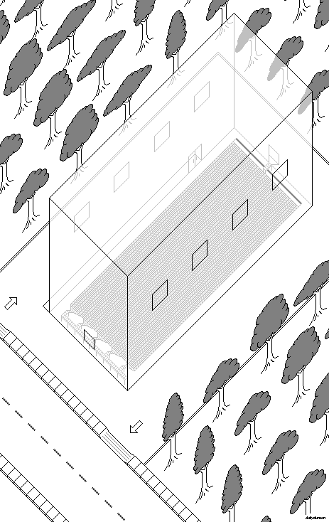
A possible solution to these issues could be to replace child care facilities with child care factories. Fully automated, open all hours and built to meet standardized health and safety requirements, the child care factory uses modern industrial machinery to streamline the process of caring for young humans. Although mechanization may be a nemesis of job creation, it’s worth noting that the influx of 43 million women into the labor force did not collapse the job market.

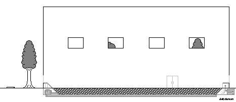
The above image is an example of the general layout of a child care factory. Parents enter the lot in their vehicle, drive around to the rear of the building and place their children in the drop-off window. After doing so, the parent receives a receipt later used to obtain the child. Once placed in the window, the children are then stripped, tagged and cataloged into inventory while gleefully tumbling along a conveyor belt before plummeting a short distance into a large ball pit. The children, or items, then spend the duration of their visit blissfully suspended in the pit while a mixture of classical music and educational material plays from speakers overhead.

While in the pit, cameras capture the events while the items’ vital signs are monitored by the tags they received upon entry. If an item exhibits an abnormal heartbeat, breathing rate or other signs of medical crisis, they would immediately be removed from the pit, and the appropriate parties would be notified, whether that be the parents, paramedics or supervising factory staff. Also, if a parent was inclined to check the status of their child, they could monitor the factory’s inventory on the company’s website or call an automated answering service, which would politely guide them through a series of unnessecary options.

The side view above shows some of the inner workings of the factory, including the ball-sanitation pump, which continuously removes and sterilizes the plastic balls before returning them to the pit. Also visible is the dredging claw and pneumatic cylinder. The claw is comprised of a pleasant, robust material as to avoid damaging children as they are gently snared in its soothing hooks.

The items also receive nourishment from the nutritious coating that is continuously applied to the balls after cleaning. This solution provides the perfect balance of vitamins, minerals, fat and protien that a growing child requires. And since children can’t help but attempt to put everything in their mouths, they actually feed themselves.

When a parent is ready to pick up their child, they simply drive through the pickup window and scan their receipt. The item is then located using tag and a portion of the claw extends to dredge them from the pit. The item is then placed on a conveyor belt and sanitized before appearing at the pickup window along with its clothing. The parent then places the child in the vehicle and continues about their business.

Industrialization has proven to increase safety in areas such as food production and product assembly, so it seems feasible to entrust our offspring to its lifeless, metallic arms. After all, we never leave prized possessions with strangers.

Survey Says

Imagine that you’ve just returned home after an arduous day at the office. Using what little energy remains, you hobble to the living room and slump your limp frame on the sofa. Then, in an attempt to drown out the haunting echoes of your obnoxious coworkers, you switch on the television and dial in to the local news station. Thankfully, you tuned in just in time for a very special report.

“A new study shows that our city has the third worst child poverty rate in the state.”

“Third worst,” you wonder, “what’s going on in this town?”

Of course you would wonder such a thing. After all, a city ranked third worst in child poverty must be doing very poorly at dealing with the issue, right? Although this is a possibility, the study itself actually says almost nothing about the state of child poverty in the city. Let’s find out why this is the case.

First of all, it’s important to recognize that the position of having no position on an issue is a position – a position of neutrality that reflects a lack of emotional investment. Second, although most studies are conducted with the intent to produce unbiased information, it’s worth noting that they are often funded or even conducted by organizations with a vested interest in the results, which undoubtedly leads to selective publication or manipulation of data. Third, and most importantly, we should be aware that studies alone are largely meaningless, for without context and implication, information does little to inform. This is because the manner in which information is collected through studies is not relevant to the common person. It must be made relevant by interpretation and presentation, such as a selective ranking used to imply poor performance.

If we were to explore the data in the example mentioned earlier, we might find that the city third worst in child poverty was only a narrow margin behind the top ranked city, or maybe we would learn that the city showed great improvement over the last year, perhaps more improvement than any other city. It’s possible that the top ranked city is declining while the third lowest ranked city is showing significant improvement, in which case we should probably show more concern for the declining city. We also don’t know the history of the cities, which may heavily influence child poverty rates. There are so many missing pieces of information that could change our reaction to the study that such a report is hardly worth our attention. Also, as we learned before, there can only be one winner, so ranking results will always produce disappointment. After all, if the third worst city were to improve to fourth worst, some other city would then inherit the rank of third worst.

News reporters, politicians and talk show guests regularly cite statistics in order to persuade listeners, but this is often done by ignoring certain studies. An example of this would be the Summer of the Shark, which occurred in 2001. Sensationalist coverage of shark attacks during the period eventually resulted in calls to pass legislation to address what seemed like a growing number incidents. However, the number of attacks in 2001 was actually 76, down from 85 in the previous year.

Sometimes statistics are misused not by ignoring studies, but by drawing connections between unrelated statistics. It is commonly cited that a person more likely to die from a coconut dropping on their head, than from a shark attack. However, this statistical analysis fails to take many factors into account, such as geography and recreational preference. For example, a person who regularly surfs on the coast of South Africa, where there many great white sharks and no coconuts, should not feel safe because of the statistic. Another example would be if female swimmer took comfort in knowing that 80% of drownings victims in the United States were male. This statistic doesn’t necessarily mean that women are better at swimming. If that were the case, then white people should also feel safe, since their drowning rates are significantly lower than those of other races. These are yet more examples of how a probability may be improperly understood to imply a possibility. It’s also strange that people are quick to preach the dangers of certain behaviors, like skateboarding and combat sports, yet feel comfortable with far more deadly activities, like eating and swimming.

Some studies don’t just provide data, but are based on correlations and attempt to identify a relationship between two variables. Unfortunately, the conclusions drawn from correlational studies can be highly subjective and even dangerous. Take, for example, a recent survey that identified that people who regularly consume popcorn are less likely to experience heart attacks. Although the findings may be accurate, the study’s correlation does not, in itself, identify popcorn as a reliable heart attack prevention agent. The deduction most make is that consuming popcorn prevents heart attacks, but the study does not offer an explanation as to why those who consume popcorn have less heart attacks – we must draw that conclusion ourselves.

One such conclusion is made by those who note that popcorn, among other snack foods, contain antioxidants – molecules that are thought to prevent diseases such as cancer. This conclusion seems to explain the correlation, but it’s just as likely that those who eat popcorn are more likely to exercise or that they don’t eat as much of other, less healthy snacks. Maybe popcorn does cause heart attacks, but it just causes fewer than ice cream. The study doesn’t tell us how or why the results occurred, which leaves the door open to interpretation and bias. It’s possible that this study was funded by a popcorn company that selected, or even paid, scientists who favor an antioxidant-rich diet to share their opinion. Perhaps the publication of this study will actually result in a greater number of heart attacks due to a massive increase in popcorn consumption by misguided people attempting evade the very fate they incur.

The job of researchers to collect and publish data. The job of writers and publishers is to decide what it means. So next time you hear a study or statistic cited, question the conclusion that follows. It’s entirely possible that it’s worth ignoring.

Attention

The ability to multitask is a trait that many believe does not belong to everyone. It’s often said that the female sex is superior at multitasking or that it’s a learned ability that some never acquire. There are even anecdotes that describe the inability of people with blonde hair to simultaneously walk and chew gum. This example is obviously absurd, as the blonde person would first have to decipher how to open the packaging. Regardless of these commonly held beliefs, the capacity to multitask is one possessed, in some capacity, by all people.

Although the ability may be universal, the degree to which one can multitask largely depends on the complexity and familiarity of the tasks at hand. Most everyone with the ability walk and clap their hands could easily do both at once, but far fewer people could play the piano while reading a book. The ability to multitask has less to do with the number of tasks one is carrying out than the attention required by those tasks.

If we wanted to measure the ability to multitask, we would first have to rate the attention needed for tasks that we perform. After all, some activities, like doing jumping jacks, require the use of our entire body, restricting us from participating in any other physical activities. However, jumping jacks are fairly simple and don’t require much coordination, so our minds are free to do other things. Other tasks, such as reading or drawing, can be done with minimal physical effort, yet demand much our of mental focus.

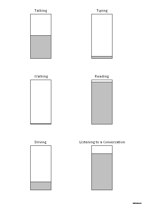
It might help to think of our capacity to give attention as a reservoir,  with each task we take on draining from the pool. If there is not enough attention remaining to perform an additional task, then it can’t be added to our workload without paying inadequate attention to one or more other tasks.

Above are some examples of tasks that require varying levels of attention. As we can see, reading and listening to a conversation are tasks that require a great deal of attention, while walking and typing can be done without much thought. Some tasks, such as walking, actually require so little attention that they hardly register as a conscious act.

It’s important to realize that the degree of attention that a task requires may vary from person to person depending on their abilities and familiarity with the task. If a person finds a task difficult, then it will likely demand more attention than if they found it easy. As we become familiar with movements and patterns, they become easier and therefore require less attention. When we become very familiar with a task, we may even relinquish its control to our subconscious, permitting our mind to focus on other functions. This allows us to do things that would normally require more attention than we can offer, which explains why we sometimes see people eating or reading while driving – a very unwise move.

In the same way that we can allow our subconscious to take control, we can also take conscious command of tasks that normally require little attention. By doing so, we can perform them with extra care and intention. But this may disrupt our normal routines, which can cause us to make errors. This explains why we always screw up when the boss is watching. Another potential hazard when paying too much attention is that some tasks just aren’t meant to be contemplated. If we begin to think about our breathing or our footsteps, we can be driven mad by fixating on a function that should be automatic.

There are many other reasons why a task may require more or less attention, since humans vary greatly in ability and experience. What qualifies as a simple, mindless activity for some could be extremely arduous for others. However, one thing is certain: everyone can multitask.

Cleavage

cleave. [kleev] -verb.

1. to join together or integrate as a whole. A man shall leave his father and mother, and shall cleave to his wife.

2. to divide apart or separate into pieces. The lumberjack used his hatchet to cleave the branch in two. 

Concerning Keys: Part II

In part I we learned a little about the origin of the modern QWERTY keyboard layout, as well as some alternatives. However, there is much more to modern keyboards, specifically personal computer keyboards, than the arrangement of the 26 letters of the alphabet. Let’s explore the rest of the keys and functions and consider how the standard design might be improved.

Despite the general contentment toward standard keyboards, there have been revisions over the years. Space is limited on laptop computers, which has resulted in many condensed layouts that remove the lesser used keys. Some desktop models have extra keys along the top or side which can be used to quickly access the Internet browser, volume control and other common functions. High end gaming keyboards add glowing lights and special keys tailored to meet the needs of gamers, distracting them from the realization that they spent the entire day alone in a dark room pretending to be an Elvish sorceress. Google’s Chromebooks use a layout that features, among more common changes, an interesting adjustment: the replacement of Caps Lock with a Search key. However innovative and helpful these ideas may seem, they are insignificant compared to the advancement in computer processing power.

In 1993, Intel released the revolutionary Pentium processor. This technological wonder oscillated at a blistering 60 MHz, which means that it could perform 60 million calculations per second. 20 years later, Intel’s i7-3690x features 6 cores, each of which operate at 3.33 GHz, making it about 333 times faster than the first Pentium, even though its name isn’t as inspiring. Despite these incredible internal advancements, computer interface design has largely remained stagnant. If we ever expect to swipe floating transparent controls, like Tony Stark, we’re going to have to move a little quicker.

It could be argued that the recent popularization of touchscreens in mobile devices is an interface advancement, but both touchscreens and holograms, while visually stimulating, share a weakness that prevents them from replacing the keyboard. The problem is that touchscreen and hologram controls are visual, not tactile. This forces the user to look at the interface in order to interact with it. This may not seem like a serious issue, but the speed and accuracy with which a user can use the machine largely depends on the ability to simultaneously input commands while receiving information. If the user’s attention is focused the interface, then the user isn’t observing the results of their commands. Also, the gestures used in touchscreens and holograms, while intuitive and impressive, require far more time and effort than striking a key. So instead of waiting around for a new technology to solve our problems, let’s work with what we have and make the keyboard as effective as possible.

In order to determine the most efficient use of space on the keyboard, we must know a few things. First, how many keys are necessary, second, what functions they should perform, and third, how they should be arranged. Once we understand the needs of users, we can use the principles of part I to construct an optimal layout.
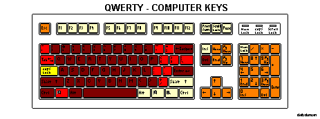
Although a standard computer keyboard has only 104 keys, the number of possible functions is actually much higher because modifier keys, such as Shift, Control, Alt and the Windows key, can be used to alter the function of other keys. Technically, every key on the keyboard could be used as a modifier, which means that the total number of functions would the factorial of the total number of keys divided by the factorial of the number of keys minus the length of the key combination.

N = K! / (K – L)!

So if we’re only hitting only one key at a time, the answer is obvious.

104! / (104 – 1)! = 104

Now let’s see how many two-key combinations we can make.

104! / (104 – 2)! = 10,712

So the the number of permutations using only two keys is an astounding 10,712. This means that users can access 10,712 unique functions by moving only two fingers. If we used all of the keys to perform one command, the total number of key combinations would be a far larger number.

104! / (104 – 104)! = 1.0299 * 10 ^ 166

Now we obviously aren’t going to use all 104 keys to perform one function, and it’s also unlikely that we would use every key as a modifier, but even with only the standard modifier keys, we still have 2,304 distinct five-key combinations. However, of the 104 keys found on a standard keyboard, about 82 are used consistently (66 if the numeric pad is omitted). Of those 82 keys, only 57 are accessible without moving at a hand away from the letter keys, and a mere 40 can be used without straying from the default typing position.

It’s also important to note that many of the keys are duplicated, including the number and arrow keys, Insert, Delete, Home and End. The total number of redundant functions on a standard keyboard is an alarming 28. This reveals how inconsequential the addition of a Search key would be, which brings us to the second issue: the function of keys.

The function of most keys is actually quite different from their title. This is because the computer keyboard was designed many years ago, and it was intended for purposes quite different from those of today. The 12 numbered function keys along the top of the keyboard, for example, were created to perform special commands in a outside of the normal range in a command line interface. Although desktop computers still include them, they serve almost no purpose in modern computing. Another example of a residual key is Break/Pause, which originated with telegraphs as a way of interrupting the circuit.

Some keyboards have removed or renamed these dated keys, but still fail to make changes of significance. This is largely because of the versatility that a keyboard offers, since the function of keys can be defined by software. In other words, keys can do different things depending on which program the user is running, so their name is not important.

So now we know that 104 keys is far more than necessary. We also know that many keys are neglected vestiges and that their labels are inaccurate and, therefore, irrelevant. As far as the arrangement of the keys is concerned, this is a more complex task, since analyzing letter patterns in typing is much easier than determining how frequently, and for what purposes, users employ computer-specific keys. This is because computers have far more uses than a typewriter and each of those uses has its own optimal layout. This makes it impossible to construct a solution that perfectly caters to every users needs. However, it’s undeniable that a more efficient keyboard design in general would increase the efficiency and comfort of nearly all computer users, so let’s take a look at an alternative that takes these discoveries into consideration.

The most significant change to notice is that the function keys, numeric pad, arrow keys and other outer keys have been removed and now exist as alternate functions on the more accessible keys. This is because it’s much easier to simply use a modifier key than to move a hand to another area of the keyboard. The optimized QWUIO layout features fewer keys, only 49 in total, but more modifiers, with 14. Notice that none of these 14 keys are labeled with a specific function. This is because labeling can restrict the utility or confuse the user, since their function will vary based on the user’s needs. And as far as lock keys are concerned, there really isn’t any reason need for them, since a modifier could be locked or unlocked by simply pressing the key twice in rapid succession.

Now 49 keys might seem like too few, especially for those who have been frustrated by tiny laptop keyboards, but the reason why new layouts fail to take hold is because, like the Colemark, they attempt to innovate and accommodate. No one can serve two masters. The 49 key QWUIO layout, with its 14 modifier keys, actually has 365 times as many five-key functions as a standard keyboard, and each one can be accessed without moving a hand away from the letter keys.

The space bar has also been separated into four different keys. This may seem like a frustrating adjustment, but on a standard keyboard, our 2 most powerful digits are dedicated to the pressing of only 1 key. It’s likely that our thumbs can be entrusted with a little more responsibility. This is especially true if we consider that game console controller’s almost exclusively employ the thumbs.

There are also a few common multi-key functions that have been bound to a specific key, such as cut, copy and paste, undo and redo. A Lock key has also been added, which could be used in conjunction with one or more modifiers to enable a customized mode, layout or language.

It’s important to remember that the ideas suggested in this alternative layout are meant to spur the mind to imagine what kind of innovations are possible, rather than provide a concrete solution. Perhaps one day we will transcend the requirement to communicate with computers through our fingertips altogether, instead using thoughts or dramatic hand gestures, but until then, we should be making the most of our situation.

Concerning Keys: Part I

Since the creation of the mechanical typewriter in the early 19th century, and subsequent popularization, our writing habits have been on a steady trajectory toward tool-assisted methods. One commonly debated issue among early inventors was the layout of the keys, which originally resembled those of a piano more than modern computer keyboards. An inventor of the first commercially successful typewriter, Christopher Sholes, at the advice of his friend, designed the predominant alphabetical layout, known as QWERTY.

The name QWERTY comes from the arrangement of the first five letters in the upper left corner. The design aimed at reducing jamming caused by the rapid pressing of nearby keys. In order to resolve this issue, Sholes separated common combinations of keys, such as HE, AN, ND and EN. The result was slower typing but less jamming, which meant that the overall speed of entry was increased.

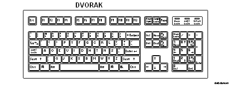
Some might be startled to learn that they are needlessly typing more slowly, but attempts to introduce more efficient layouts have failed. In 1936, Dr. August Dvorak and Dr. William Dealy patented a design intended to increase typing speed by reducing the average distance required for fingers to travel between keys. Since some letters are more common than others, moving the more common letters into easy-to-reach locations supposedly made typing faster and less awkward.

Although studies of DVORAK’s effectiveness have yielded contrasting results, the creation of a more efficient key layout is a step that many believe should be taken. Part of the reason for inconsistency could be the difficulty in transitioning to an unfamiliar system. This idea lead to the creation of the Colemark keyboard layout, which was less efficient than DVORAK, but was thought to be an easier transition for those accustomed to QWERTY. However, the difficulty involved in revolutionizing an established system is impossible to circumvent, so the adaptation should make the most of such inconvenience and provide the greatest possible improvement. Colemark is only a marginal upgrade from QWERTY and would still require drastic changes in habit, documentation and industry standards. Transitioning to the DVORAK layout would require the same changes, but offer greater efficiency. But is DVORAK really the most efficient keyboard layout?

In order to determine where the letter keys should rest, we must first examine the basics of typing. On modern keyboards, the correct inactive position for the hands is to have the index fingers resting on the keys with small bumps (the letters F and J in QWERTY) with the remaining fingers on each hand resting on their corresponding adjacent keys (the letters A, S, D on the left hand, and K, L, ; in the right hand). Proper typing practice teaches that the nearest finger to the desired key should reach out from its default position, strike the key and return. The goal is to have the fingers do the work while the hands hover motionless above the keyboard. This is because we have nearly 6 times as many fingers as hands, each of which can be moved more quickly and accurately than a hand.

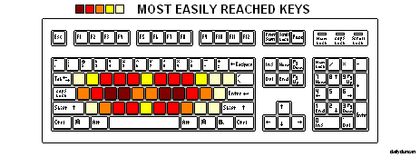
Now that we know where our hands should rest, we can extrapolate the general area in which the letters should be placed. Since it’s most efficient to keep our hands still, it would make sense to keep the most commonly used keys within reach of the our fingers from the resting position, but here’s where things get complicated. Some of our fingers are stronger and more obedient than others, namely the index and middle fingers, which means that some key locations are easier to reach than others.

So now that we know the real estate value on a keyboard, the next step should be to simply place the most commonly used keys in the easiest to reach locations, but before we can proceed, we must take a closer look at the intricacies of typing.

As we’ve seen with numbers, some letters are more common than others, but there are also more common letter combinations and patterns. In addition, not all finger movements are equally fluid; it’s been shown that our fingers more easily move to and from the upper row than the lower. The most difficult movement is known as hurdling, which is when a finger leaps over the center row to reach the next key (as with the letters CR or MY in QWERTY). Also, most words involve a great deal of alternation between consonants and vowels, as with the word populate, and since we can type more quickly by alternating hands, it would make sense to keep vowels on one side of the keyboard.  It’s also important to note that the inner letters of the keyboard (Y, G, H, B in QWERTY) can draw the hand away from the default position, especially if the typist has small hands. On top of all that, most people are right handed, which means that the right hand is slightly more agile than the left, making the keys on the right side of the keyboard slightly more accessible.

In light of these important details, an ideal keyboard layout should follow these rules:

  1. The most common letters should be placed in the most easily reached locations, preferably on the right side.
  2. Vowels and common consonants should be kept on opposing ends of the keyboard.
  3. Letters that are commonly used together should be placed in locations that allow for the easiest transition.

Presenting the most efficient keyboard layout ever conceived: QWUIO.

There are a few key differences to note in the QWUIO layout. First of all, as with DVORAK, all of the vowels are moved to the left side. Unlike DVORAK, however, all of the vowels fall in the center or upper row, within reach of the index and middle fingers. Another important change is the positioning of the period, comma and apostrophe in the center of the keyboard. This allows for the hand to return to the default position while the space bar is struck by the thumb. In addition to being an uncommon letter, K also ends many words, so it is included in the center keys.

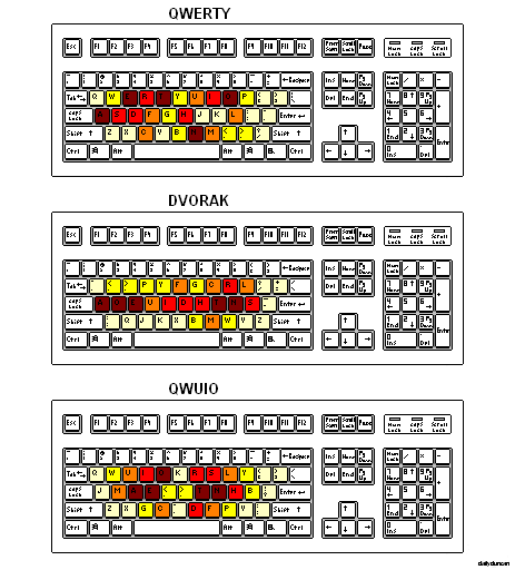
In order to better understand the improvements offered by this QWUIO, let’s compare the placement of the most commonly used letters.

As we can see, QWERTY does a good job of relegating uncommon letters and punctuation to the outer regions, but seems purposeless in its placement of the more common letters, even seeming to favor the left hand slightly. DVORAK, on the other hand, obviously focuses attention on center row, but heavily favors the use of the weaker outer digits. QWUIO aims to employ the index and middle fingers as much as possible while promoting a steady hand position. Now let’s compare how well our layouts conform to common key combinations.

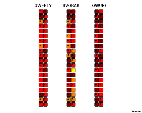
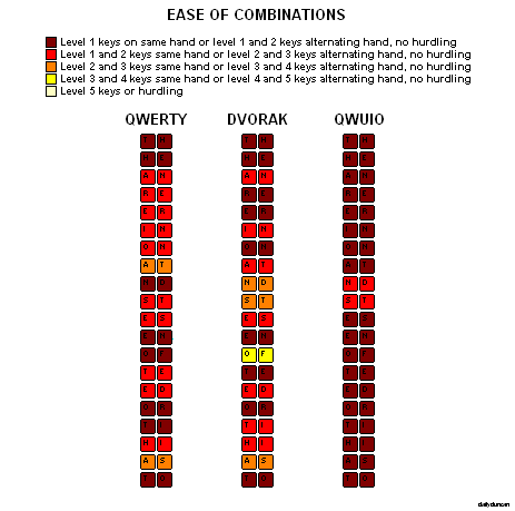
The QWERTY layout does a decent job of placing common key combinations in accessible locations, with few resting in optimal locations and few in poor locations. DVORAK places more keys in optimal locations, but at the cost of shifting many to poor locations. The QWUIO system, on the other hand, exceeds DVORAK’s improvements without making sacrifices, with over half of the keys directly beneath the resting position of the index and middle fingers. But what about the movement between the keys in a combination? What about alternating hands and hurdling?

This test reveals that QWERTY and DVORAK perform at a surprisingly similar level, allowing typists to access common combinations with general ease, but again, with DVORAK shifting some keys to sub-optimal locations in an attempt to increase efficiency. Although none of the three layouts require hurdling or the use of the outer-most keys, the QWUIO layout allows typists to execute a startling 90% of combinations using only the most effective movements and never asks typists to make any awkward maneuvers.

In part II we will discuss the relationship between keyboard layout and more advanced computer functions. We’ll also explore additional sections of the keyboard, including the number keys, arrow keys and the numeric keypad, as well as the function, modifier and lock keys.

Laugh Track

Now listen close and hear the tale,
of how our humor died.
For once we laughed when actors laughed,
and when they cried, we cried.

When film was new and no one knew
quite how to summon laughter,
the audience would take the lead,
our laughs would follow after.

But every now and then a quip,
would not seem as clever.
Without the crowing crowd to cue,
no laughter whatsoever.

And so they sought the aid of one,
who captured that glad sound,
the cheerful noise that lifts us up,
copied, cut and bound.

He used a secret magic box,
then took what wasn’t funny,
sweetened it just to our taste,
and made a ton of money.

So now we sit and watch and wait,
for a machine to tell us when,
to react according to the prompt,
then quiet and wait again.

Thanks be to Charley Douglass,
for now we can’t be sure,
of whether what we feel is real,
and if our joy is pure.